
Founded in 2017 in Houston, TX. Small-batch, handmade homegoods for people who don't want to choose between useful and delightful. 80s/90s nostalgia meets Memphis design.
Start Here
A single-page summary of everything you need to work on this brand — written for agents, contractors, and new hires who need context fast. Copy-pasteable into a prompt.
Small-batch, handmade homegoods. Concrete vessels and catch-alls, candles and incense, totes and seasonal merch. Plus a curated selection of carried brands (Piecework Puzzles, Atelier Saucier).
Millennials + older Gen Z, 25–45. Lives at the intersection of design objects and food/kitchen culture. Shops at Areaware, Poketo, MoMA Design Store. Watches Alison Roman.
Casual · Warm · Quietly funny. We're vibing, not pitching. Short sentences. Puns welcome, cringe is not.
No one else is doing terrazzo + Memphis + humor + handmade at our price point.
Copy this into your prompt
A 250-word brief written for AI agents, contractors, and new collaborators. Paste it as system context.
pretti.cool is a homegoods brand founded in 2017 in Houston, Texas. We design and make small-batch, handmade goods that are practical and fun — concrete vessels and catch-alls, candles, incense, totes, and seasonal merch.
Our aesthetic is 80s/90s nostalgia meets Memphis design meets modern minimalism. Terrazzo patterns, bold color, food puns, shapes with personality.
Voice: casual, warm, not corporate. Short sentences. Humor is core (puns welcome, cringe is not). We don't oversell — we say what the thing is and let the customer decide.
Customer: millennials and older Gen Z, 25–45. Has taste, a sense of humor, and expendable income. Sits at the intersection of design objects and food/kitchen culture — they shop at Areaware, Poketo, MoMA Design Store, and watch Alison Roman / Molly Baz / Dan Pelosi.
Visual: Bright Pink (#F960B1) + Muted Lime (#E5F18B) are the primary brand accents. Pale Cream (#FFF7F2) is the dominant section background. Terrazzo patterns on concrete are the brand's signature surface.
We are NOT: luxury, precious, aspirational, generic, or try-hard with slang. No "elevate your space" copy. No "discerning consumer" anything.
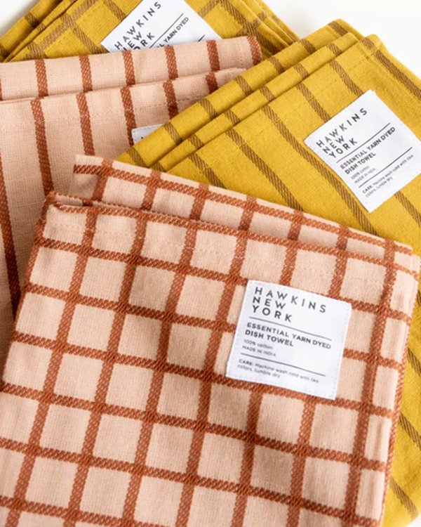
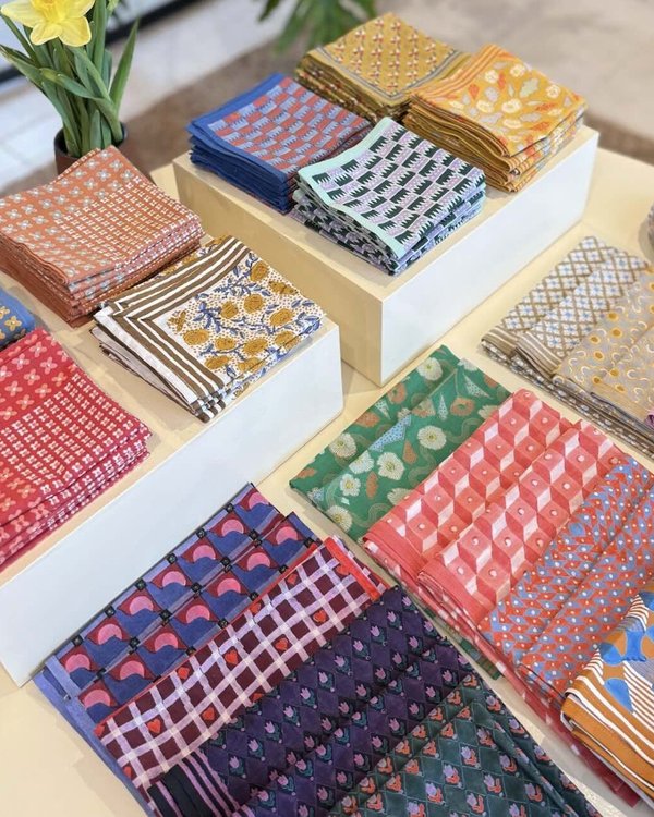
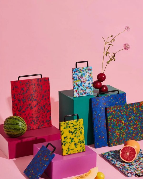
⚠️ Critical attribution warning: pretti.cool also resells products from Piecework Puzzles (puzzles, cocktail napkins) and Atelier Saucier (bottle bags, table linens). Pun-heavy puzzle names (Bread Head, Buns Out, Smart Cookie) and napkin themes (Caesar Salad, Sardines, Toucan) are Piecework's, NOT pretti.cool's. Always verify before claiming we made it.
Who We Are
Pretti.Cool was founded in 2017 by a bunch of 90s kids who wanted an excuse to collaborate on making products that are both practical + fun. We make everything in small batches by hand in Houston, Texas.
Practical + Fun — not just art pieces, not just utility. Both at once. Every product we make should feel like it earned its spot in your home.
80s/90s nostalgia meets Memphis design meets modern minimalism. Terrazzo patterns, bold color palettes, food puns, and shapes with personality.
Houston, Texas. Small batches. By hand. This isn't a selling point — it's just how we work.
Millennials + older Gen Z, 25–45. Shops at Urban Outfitters, Areaware, MoMA Design Store, Poketo. Has taste, a sense of humor, and a few throw pillows.
Our Colors
Bold, playful, and rooted in 80s/90s energy. The palette is now organized into Core (the colors used everywhere — a designer's daily kit), Extended (accent colors for variety and seasonal moments), and the Theme Color Schemes as configured on the live storefront. Bright Pink and Muted Lime remain the primary brand accents.
Core Palette
The 7 colors used everywhere — nav, CTAs, type, backgrounds. If a designer learns nothing else about the brand, they should learn these. Bright Pink and Muted Lime are the primary brand accents; Pale Cream is the dominant section background across the live theme; Light Mauve is the soft warm accent.
PMS — Primary Accent
Secondary Accent
(Schemes 2, 4, 5, 7 — most-used)
Theme — Scheme 5 buttons
No print spec yet
No print spec yet
Extended Palette
Accent colors for variety, seasonal moments, and product-specific applications. Use sparingly — they punctuate the core, they don't compete with it. Grouped roughly by color family.
PMS 156 C
No print spec yet
PMS 214 C
PMS 7421 C
PMS 567 C
PMS Blue 2728C — merch print color
Theme Color Schemes
The 6 color schemes actually in use on the live Shopify theme — the ones applied to real storefront sections. (Scheme numbers map to the theme's scheme IDs; the theme's configured-but-unused Scheme 1 and Scheme 8 are omitted here.) Each scheme is a coordinated palette. Schemes 2, 6, and 7 are the most "on-brand" — they use the full Bright Pink + Muted Lime + Black system.
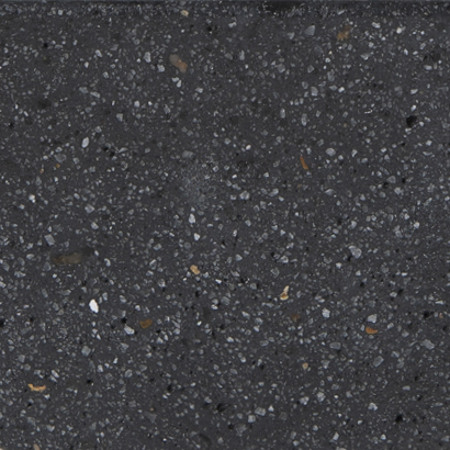
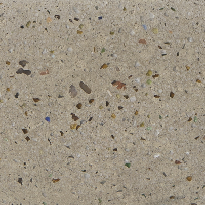
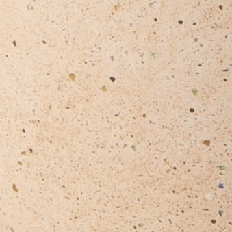
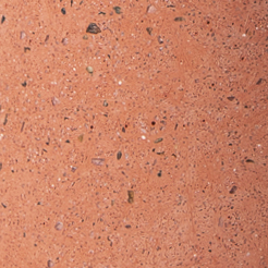
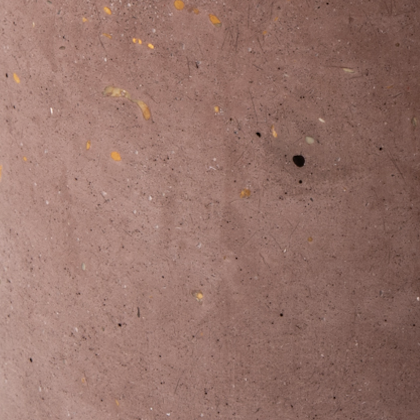
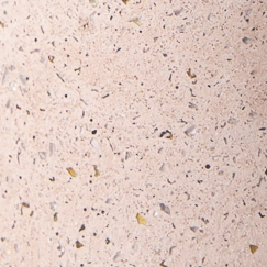
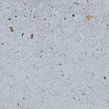
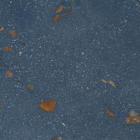
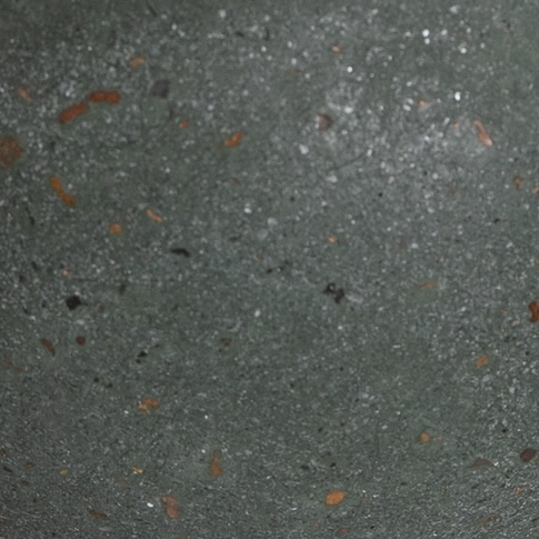
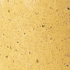
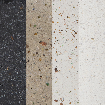
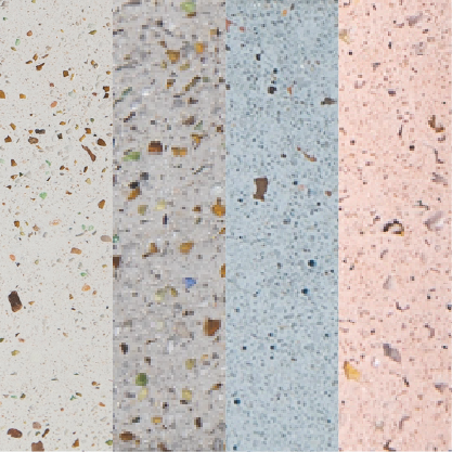
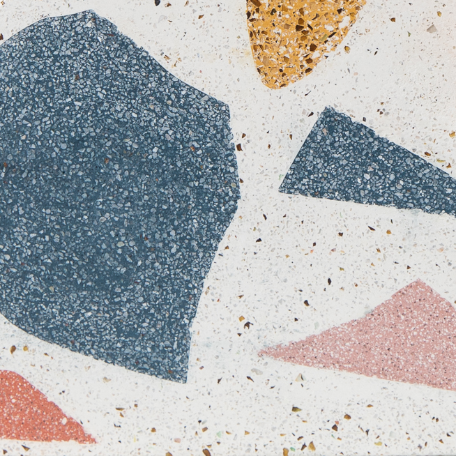
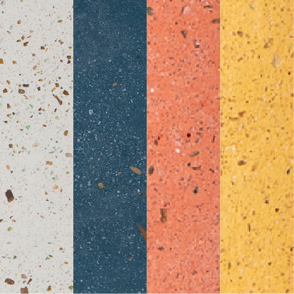
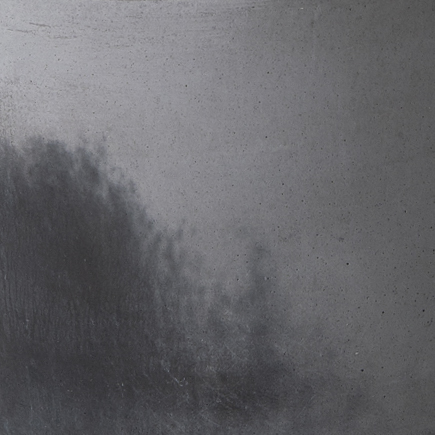
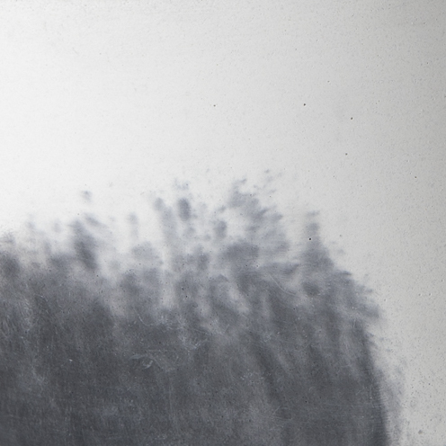
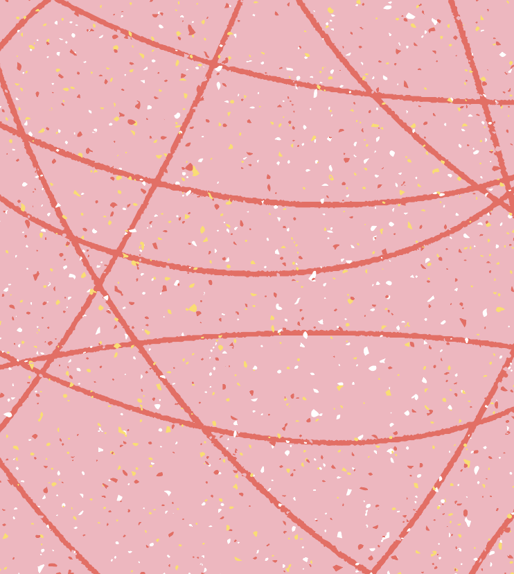
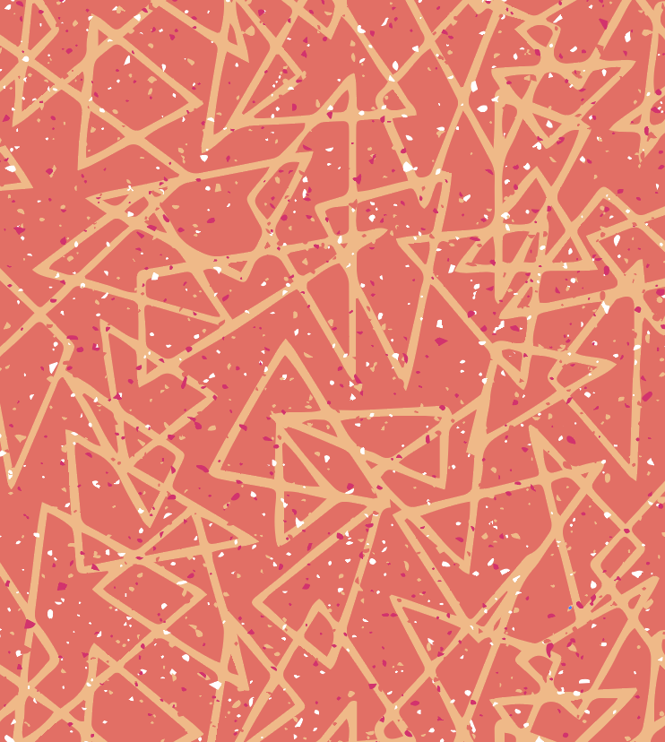
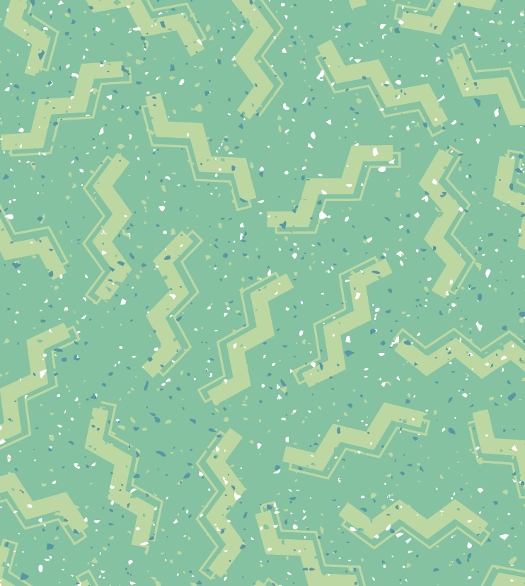
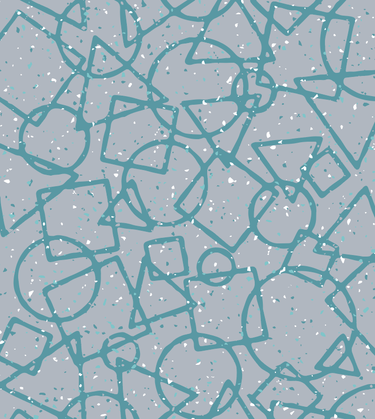
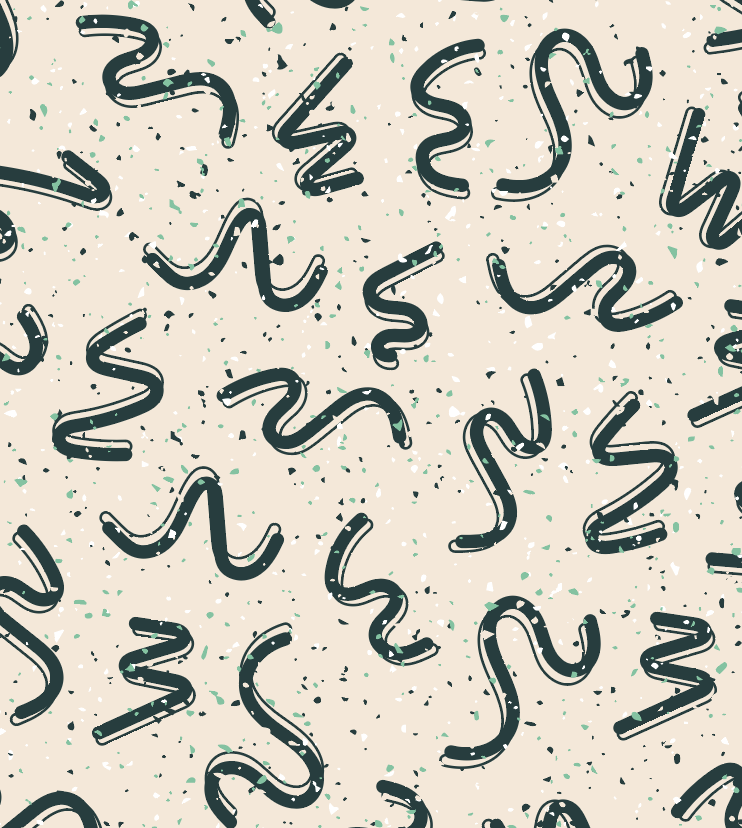
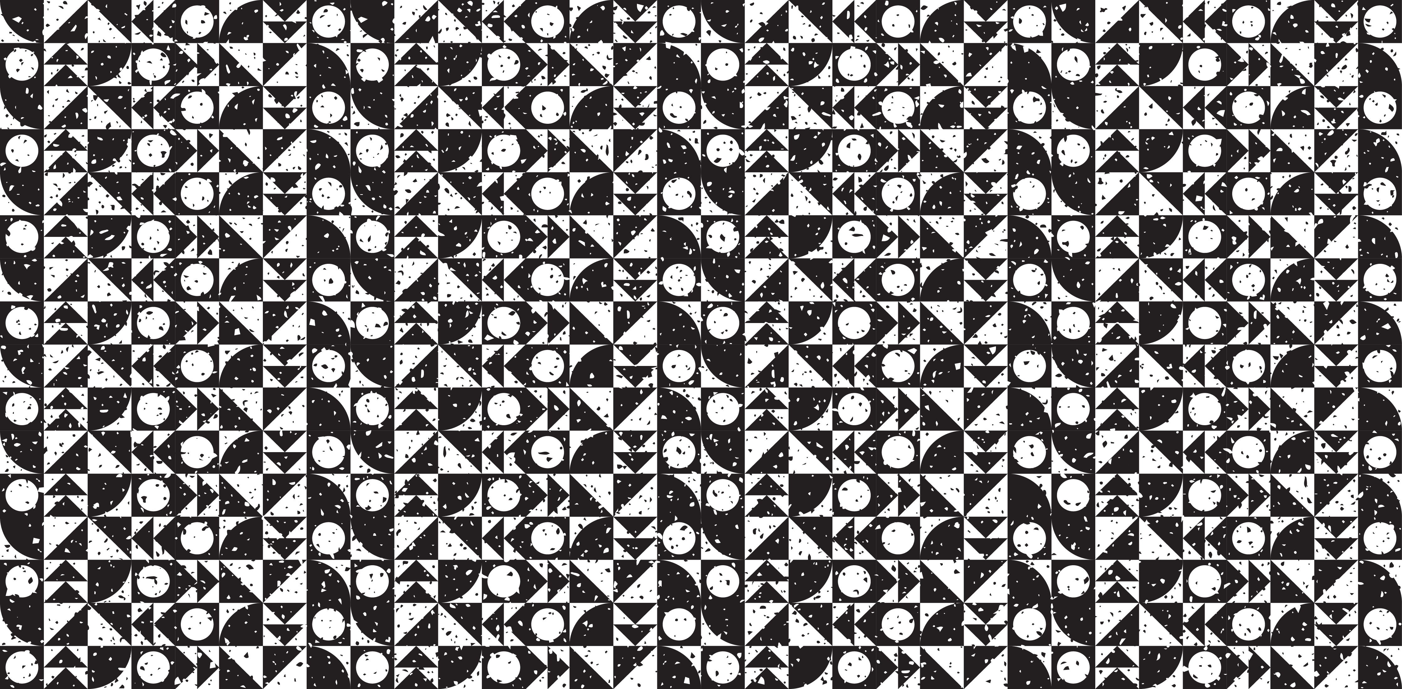
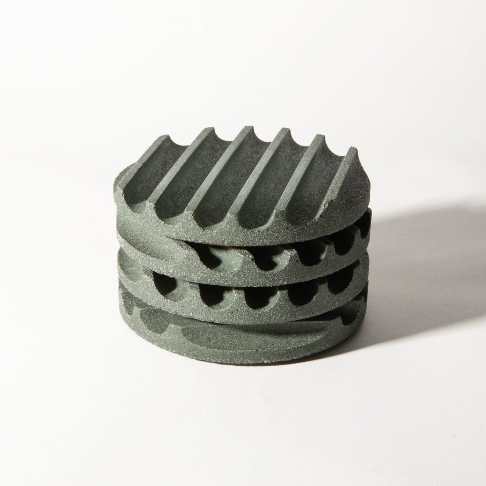
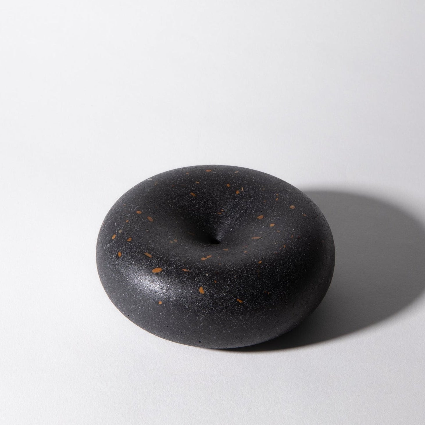
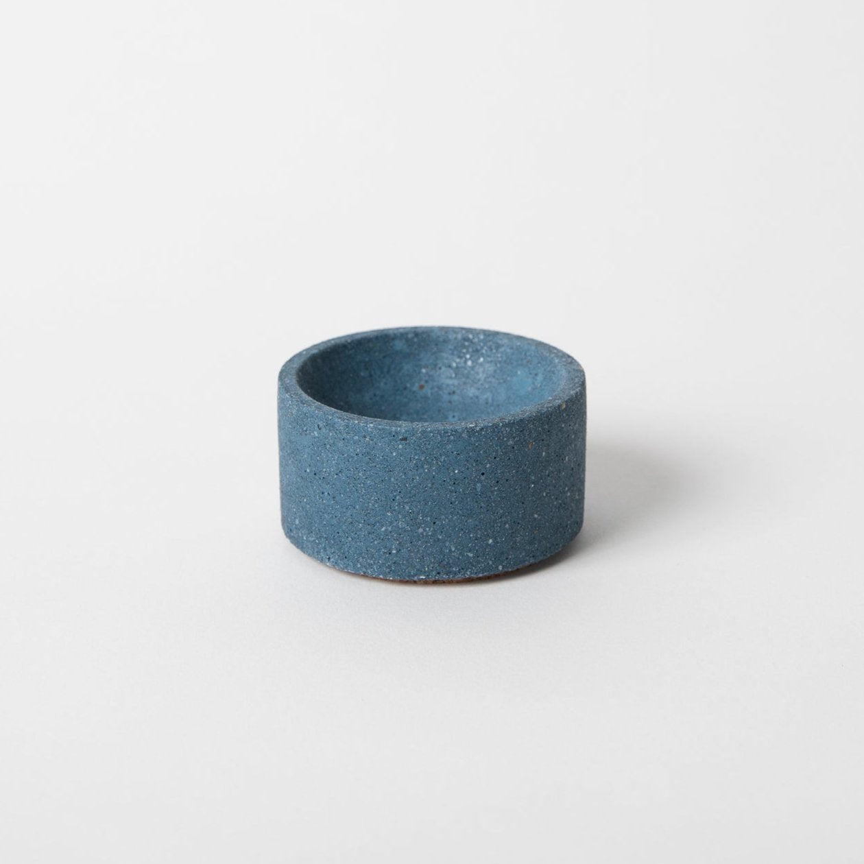
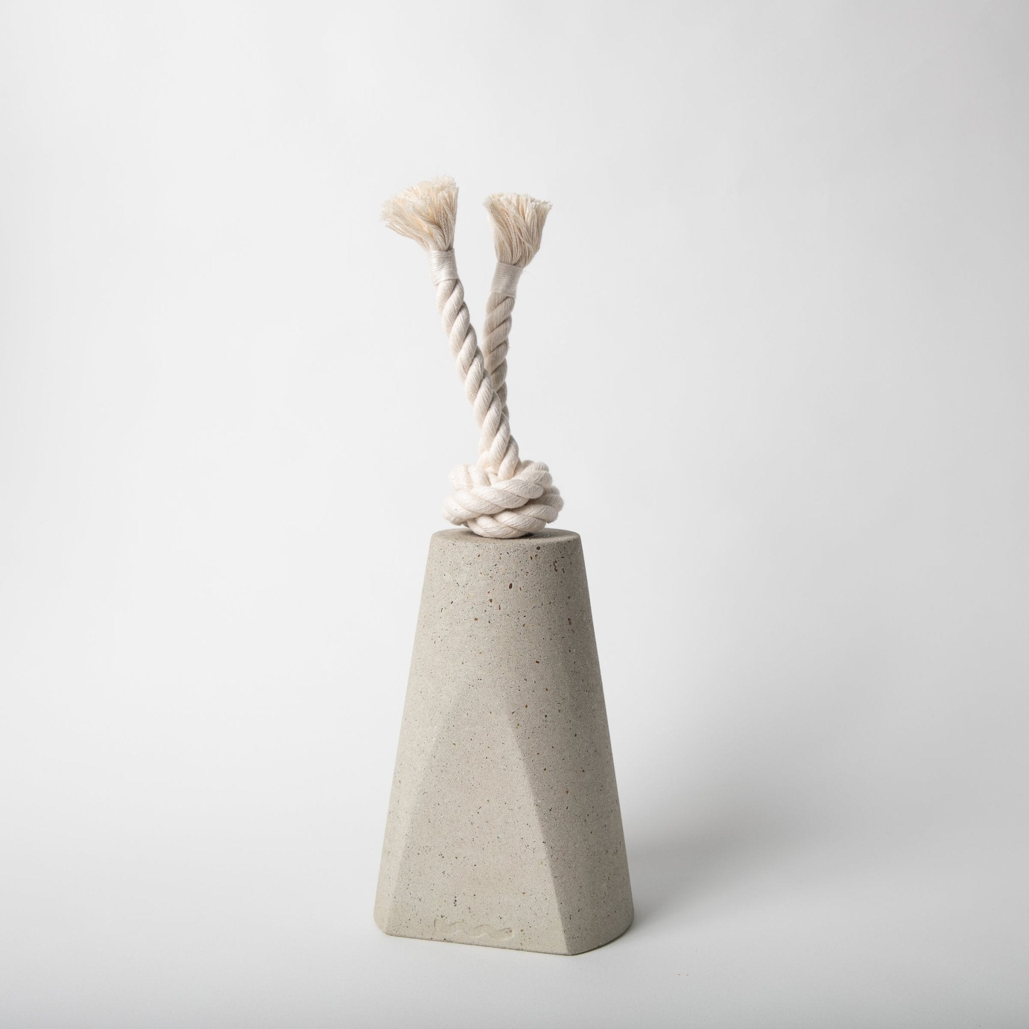
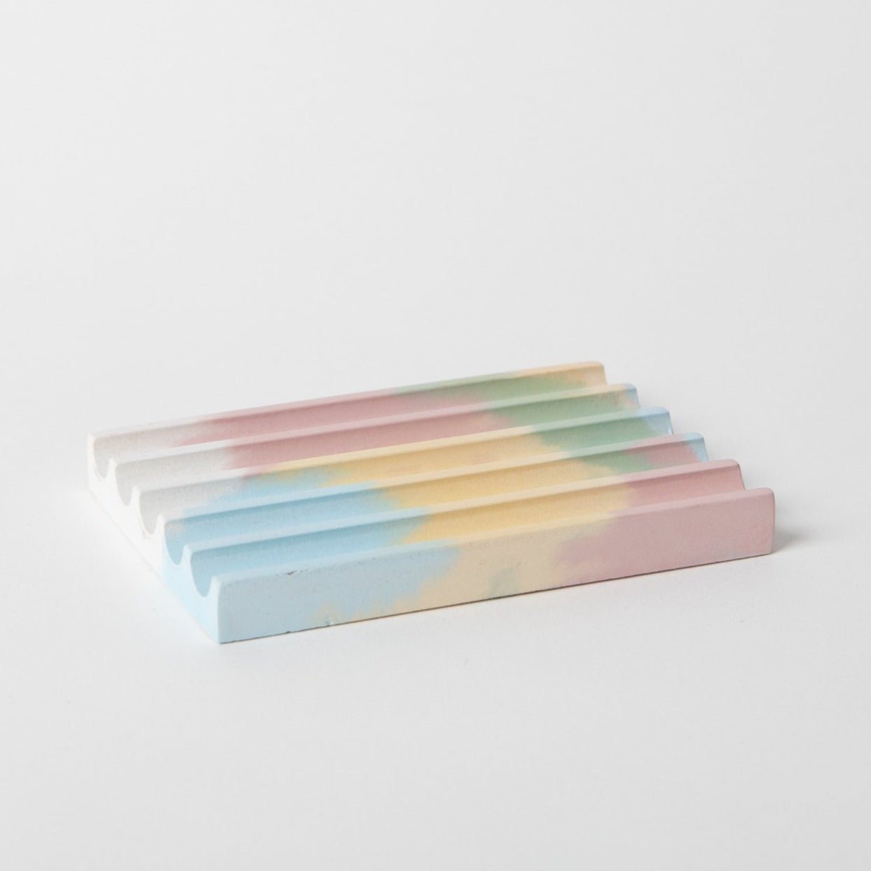
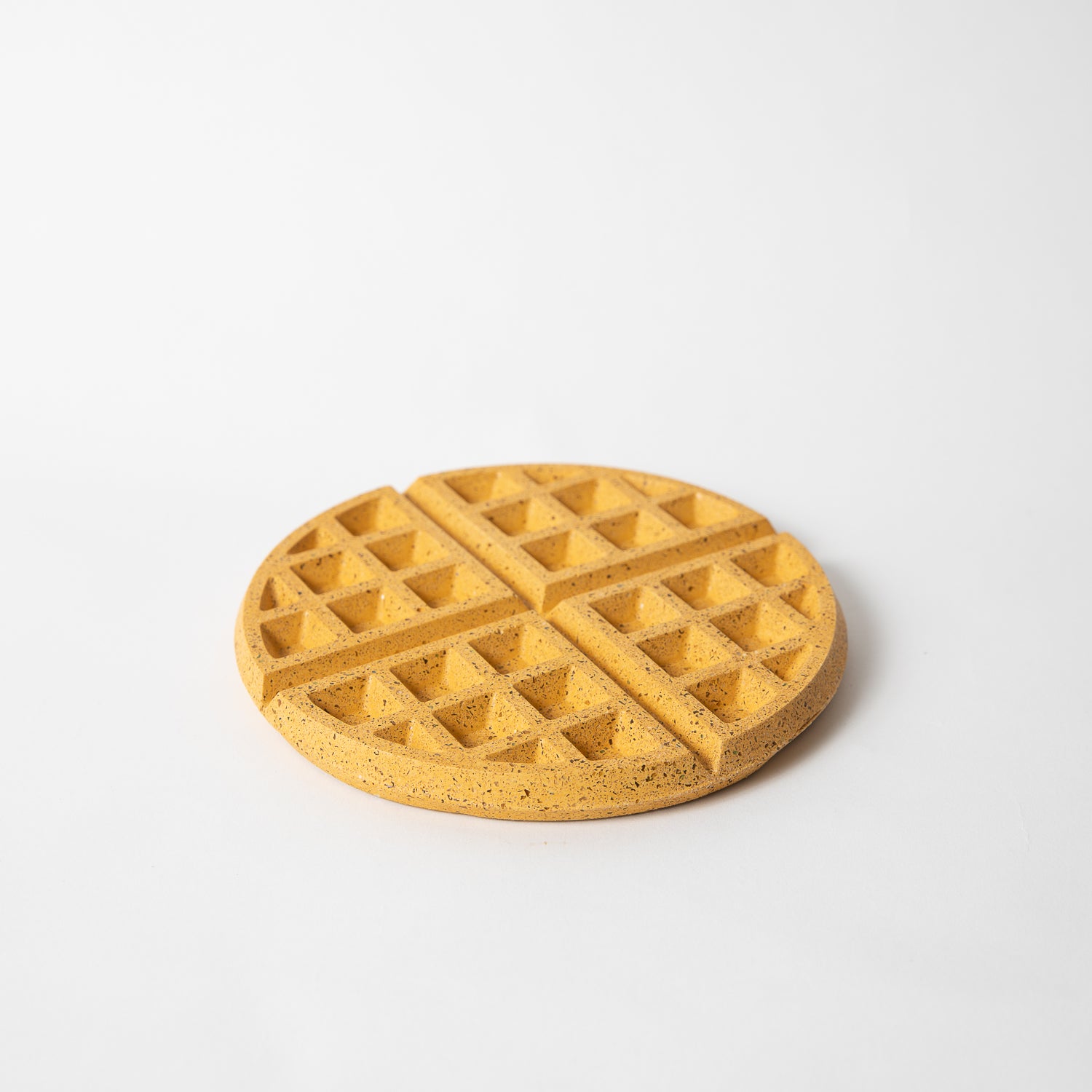
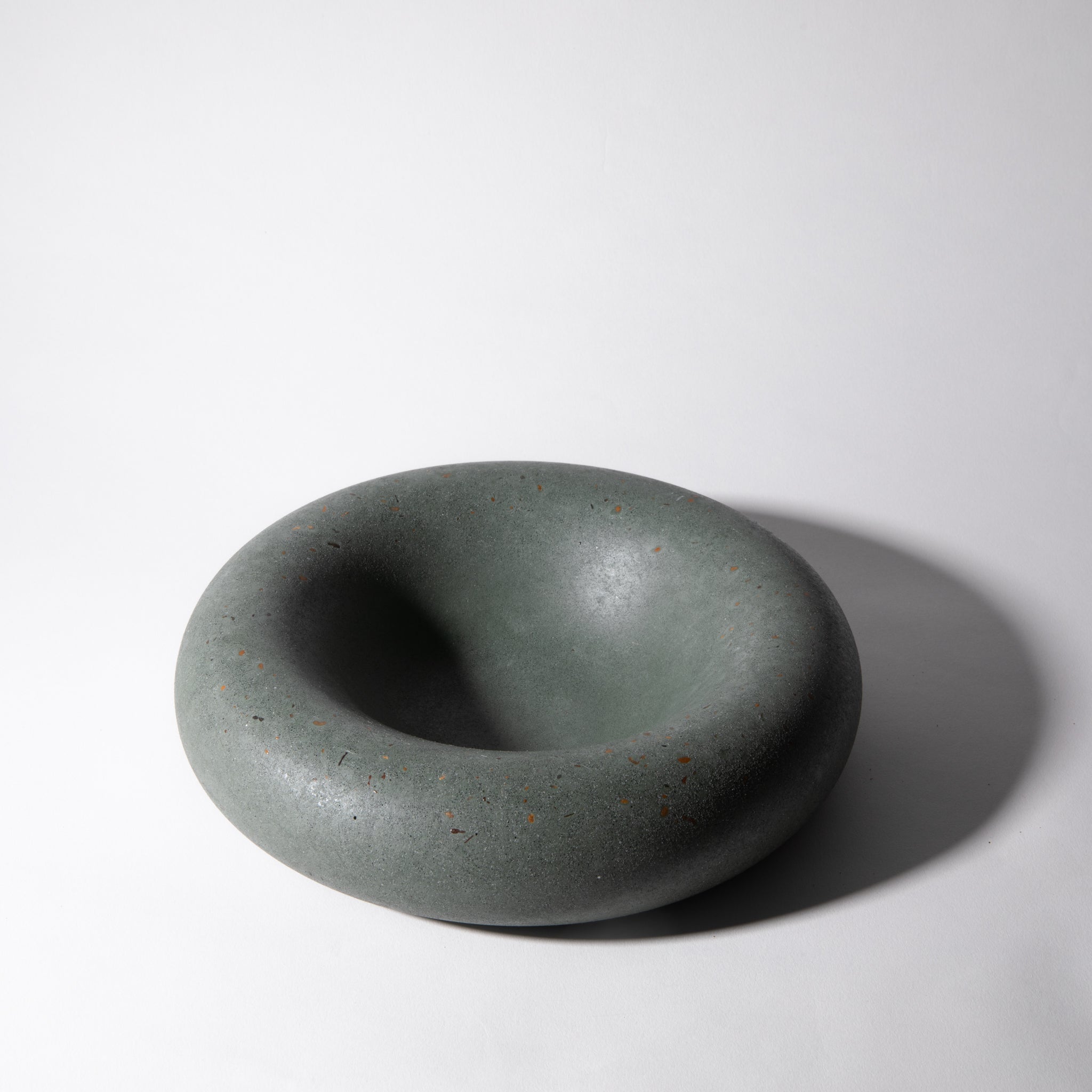
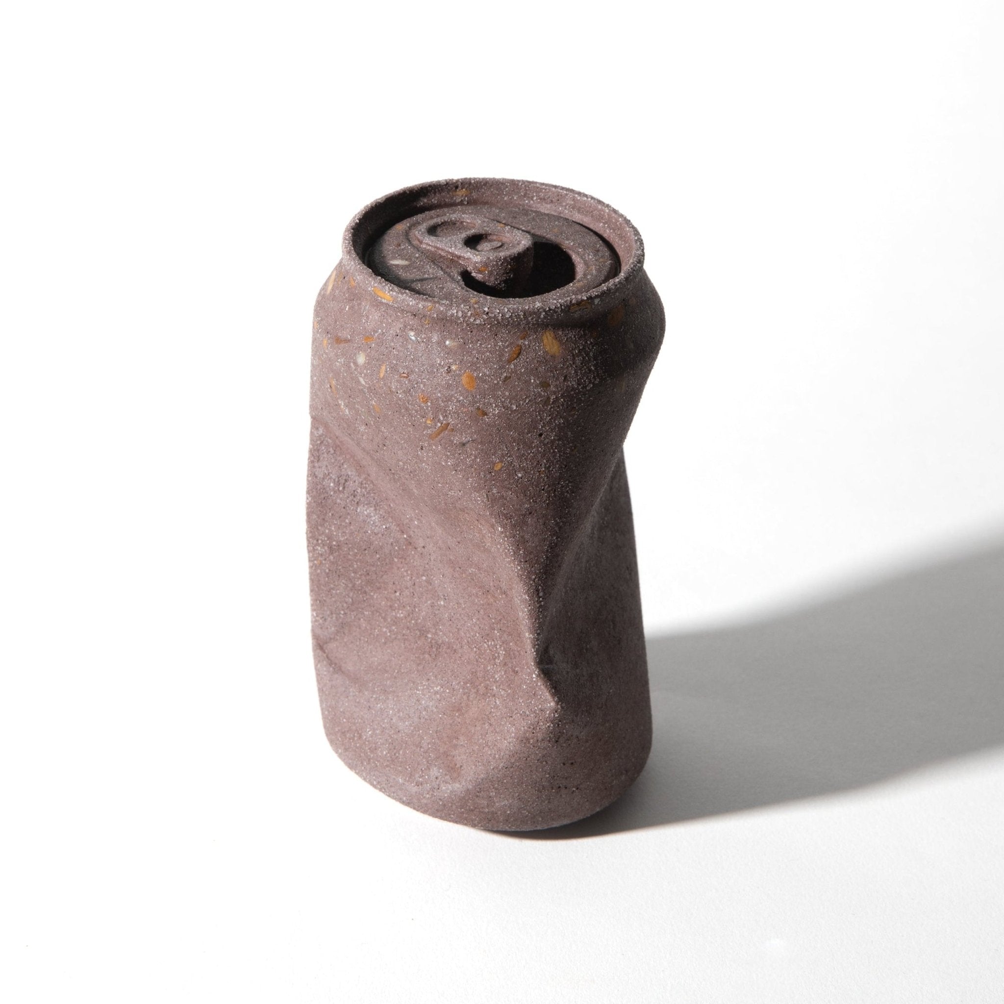
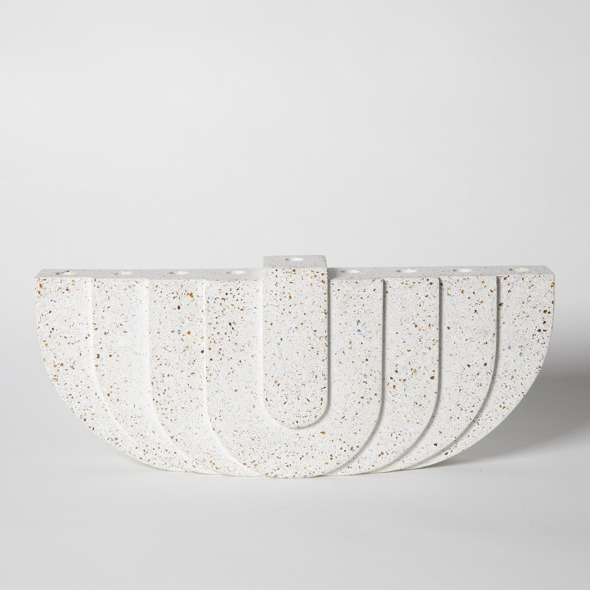
Terrazzo & Concrete Patterns
The full terrazzo library — each colorway applied to our concrete formula. These are the actual surface patterns used across the product line.
Terrazzo Colors
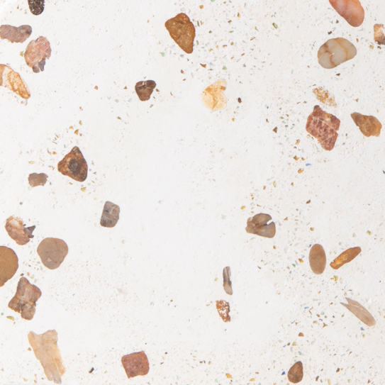
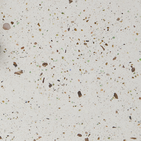
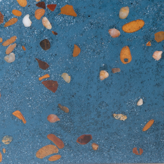
Multicolor Combinations
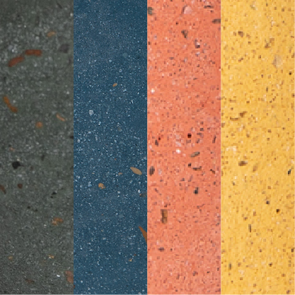
Marbled Colors

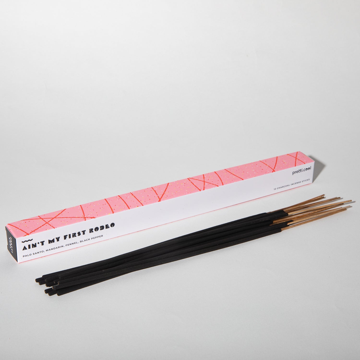
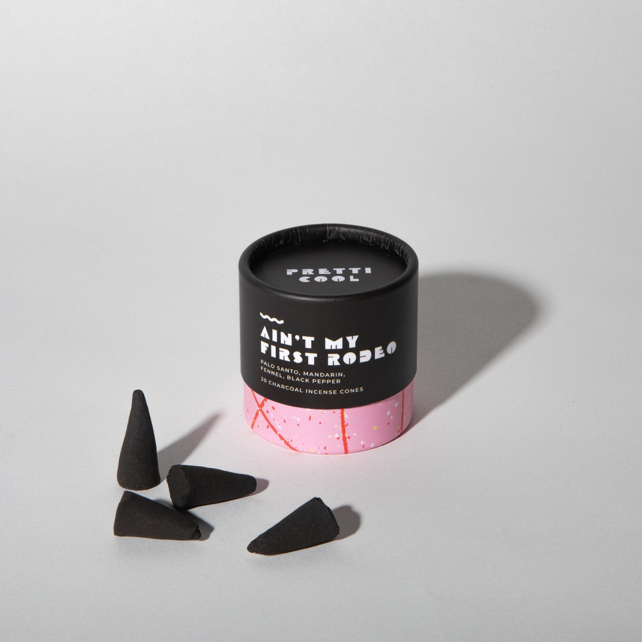
Scent Packaging Artwork
Label artwork for the scent line. Each name follows the product naming system — puns and attitude required.
Typefaces
Montserrat ExtraBold carries the brand's energy — big, confident, a little blocky. Instrument Sans keeps body copy clean and readable on screen. Pinyon Script adds warmth for moments that need a handmade feel — use it sparingly.
How We Sound
Casual, warm, not corporate. Short sentences. Humor is core — puns are welcome, cringe is not. We don't oversell. We're vibing with our customer, not pitching to them.
- Casual and warm — never stiff
- Funny without trying too hard
- Direct — we say what the thing does
- Celebratory of the mundane
- Aware the customer has taste
- Short-sentenced. We don't ramble.
- Houston-proud, quietly
- Corporate or formal
- Luxury / precious / aspirational
- Over-explaining anything
- Keyword-stuffing
- Generic ("perfect gift for the home lover!")
- Sentimental without reason
- Try-hard with slang
Copy in Practice
Names & Puns
Product names should be puns, food references, or cultural nods. The name should make someone smile — or groan. Either works. If it could be a generic product name, it's not the right name.
From the catalog
- Puns and food references are always welcome
- The name should stand alone — no product type needed to get it
- 80s/90s cultural references are fair game if they're recognizable to a 30-year-old
- Avoid generic descriptors: Modern, Elegant, Artisan, Premium, Luxe
- If the name could belong on a Restoration Hardware shelf, start over
- The name should make someone smile — even if they don't immediately get it
Logo & Lockups
Source files available from Kathrine. Use the appropriate version for your background — the logo should always be legible and never compete with a background pattern.
Wordmark — Color Variations

The 2023 Mark System
The current identity, as applied across the 2023 brand & packaging refresh — an updated wordmark suite, supporting marks, and brand graphics, paired with the geometric packaging pattern. This is the live system; build any new work on it.

- Never stretch, skew, recolor outside the brand palette, or add drop shadows
- Don't place on low-contrast or patterned backgrounds without testing legibility
- Logo source files: contact howdy@pretti.cool
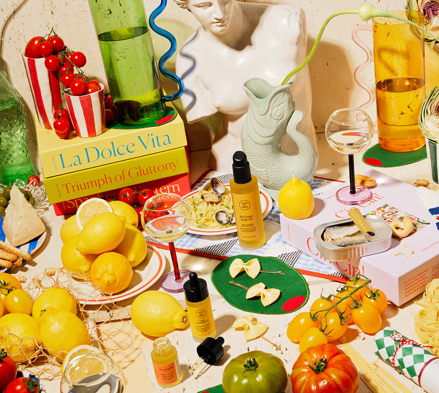
What a pretti.cool Photo Looks Like
Visual art direction for shoots, social content, and any image used to represent the brand. Covers surfaces, lighting, styling, composition, and what to avoid.
- Products in real homes — kitchens, dining tables, desk corners, mantle moments
- Natural soft warm light (window light, late afternoon, slightly overcast)
- Slight chaos — a half-eaten breakfast, books out, evidence of a real life
- Multiple products styled together (vessel + matches + candle + napkin)
- Overhead flat lays for groupings; 3/4 angle for hero shots
- Color temperature 4500–5500K with a slight peach/cream tint
- White infinity sweeps (sterile, stock-photo coded)
- Hard luxury lighting with deep dramatic shadows
- Cold blue tones — washes out the warmth that makes the brand work
- Pristine, empty staging that feels precious
- Heavy retouching — softness and small imperfections are part of small-batch
- Anything that could appear in a Restoration Hardware catalog
The Underlying Logic
Our customer lives at the intersection of design objects and food. Photos should feel like dinner-party prep, not gallery installation. The product is the hero, but it's a hero in a context — not a hero on a pedestal. When in doubt, ask: would Alison Roman post this?
Finished Copy Examples
The fastest way to get the voice right. Real examples across every context — not principles, not guidelines, just copy that works.
Product Descriptions
Real PDP copy. Lead with what it is and how it lives in someone's life. Houston + handmade as a closer, not an opener.
Email Subject Lines
Instagram Captions
Mapped to the eight content categories from the social strategy. See marketing-playbook.md for the full posting framework.
UI Microcopy
Where personality leaks into the interface. Replace stock e-commerce defaults with brand voice.
Wholesale Pitch (Snippet)
pretti.cool — handmade homegoods from a small studio in Houston, TX. Concrete vessels, candles, incense, totes, and seasonal merch. Featured in Architectural Digest, domino, House Beautiful, Elle Decor. Wholesale via Faire first order; direct re-orders to faire.com/direct/pretticool after that. Email howdy@pretti.cool for a line sheet.
Voice by Channel
Same brand, different register. How the voice shifts depending on where it lives — and what stays constant regardless of channel.
Curated · Punchy · Brand-coded. Promos go in comments, not the grid. The feed should communicate the breadth of products + personality at a glance.
"introducing the Cobalt Tote. perfect for: groceries, library books, the next vacation."
Real · Casual · BTS-y. Graphic promos OK here. The looser side of the brand — studio chaos, packing day, customer DMs.
"Tuesday in the studio. concrete day. (+ a small disaster.)"
Warm · Conversational · Lightly funny. Founder-voice, not marketing-voice. Newsletter drives the long form; flows handle the transactional.
"Hi friends — Kathrine here. New things. See below ↓"
Confident · Professional · Still-warm. Buyers don't need quirky; they need clarity. Lead with what's new, what sells, and how to order.
"Hi [Buyer] — following up on the line sheet. Happy to walk you through any new pieces over a 15-min call."
Playful · Specific · Useful. What it is, what it does, who it's for, where it's made. In that order. No "elevate your space."
"A catch-all for your keys, your lip balm, your 'I'll deal with this later' pile."
Minimal · Named · Trustworthy. Product name + "made by hand in Houston" + care instructions. The box is part of the gift; let it breathe.
Direct · Founder-led · No-nonsense. Skip the hype. Editors want facts and a hook.
"pretti.cool is a homegoods brand founded in 2017 by Kathrine Gilmer in Houston, TX..."
Looser · Faster · More chaos. Concrete pours, BTS, behind-the-curtain. Resist the urge to over-produce — this is the channel where rough wins.
What Stays Constant
Across every channel: short sentences, no overselling, humor that lands without trying too hard, and a willingness to leave whitespace. The register changes. The brand doesn't.
How the Brand Moves
For developers, social creators, and anyone making animated content. Even a handful of adjectives prevents the brand from feeling like a different entity in motion.
- Snappy easing — 200–300ms transitions, no slow zooms
- Slight tilt or wiggle on hover (3–5°)
- Brand-voice microcopy in loading states ("mixing the concrete...")
- Animated empty states (a banana rolling away, a sad terrazzo blob)
- Page transitions: quick crossfades or color flashes
- Cursor: pixel banana on the global cursor (when shipped)
- Easter eggs that reward exploration — a logo wiggle, a /backroom page
- Slow luxury zoom-ins (we're not Restoration Hardware)
- Cinematic lens flares
- Parallax backgrounds with depth — over-engineered, dated
- Anything that takes >500ms unless intentional
- Auto-rotating carousels that move without user input
- Bouncy spring animations everywhere — pick one or two specific moments
- Cinemagraphs that loop forever and are mostly subtitle
Reference Brands for Motion
Three sites whose interaction language we want to learn from. Each does something specific worth stealing.
Three labeled "Interactive Easter eggs" in the IA. Tumbleweed GIF for the empty cart. Image-as-navigation. Most direct UX peer.
Scattered campy badges ("live laugh love") that act like interactive stickers. A "GrossyWorld" zone hidden in the IA that rewards explorers.
Color-coded chevrons that double as visual interest. Filter buttons that feel like part of the design language, not ornament.
Specific Moments to Build
Concrete easter eggs and motion details we want on pretti.cool, ranked by impact ÷ effort:
- Pixel banana cursor globally (~30 min to wire in)
- Animated empty cart state — replace dead text with a banana rolling away GIF
- Hover effects on product cards — slight tilt, color flash to terrazzo, or "PEEK!" tag flip
- Microcopy in loading + cart states — see Copy Library for the canonical lines
- 404 page — currently stock Shopify, big whimsy opportunity
- Hidden /backroom page — a Dan-Pelosi-style weird zone with a surprise discount
- Logo easter egg — hover for 3s, terrazzo confetti rains
Who We're Up Against
These are the brands that share our customer, our shelf space, or our aesthetic. Understanding where we overlap — and where we don't — keeps our positioning sharp.
The short version: no one else is doing terrazzo + Memphis + humor + handmade at our price point. The category has plenty of "nice design objects" brands. There's only one pretti.cool.
As Seen In
Publications that have featured pretti.cool. Useful as credibility tags on wholesale and retail pitch decks, as warm-list targets for new-launch outreach, and as a reminder of where the brand already has earned-media history.
Some of these (domino, Apartment Therapy) also appear in section 14 as audience peers — they reach our customer and they've covered us. Re-pitching new launches there is the highest-leverage earned-media play.
Brands We Look To
Brands we admire from adjacent categories. They're not on our shelf — but their voice, design instincts, or audience teach us something about who pretti.cool wants to be. Inspiration, not benchmarks.

Voices in Our Orbit
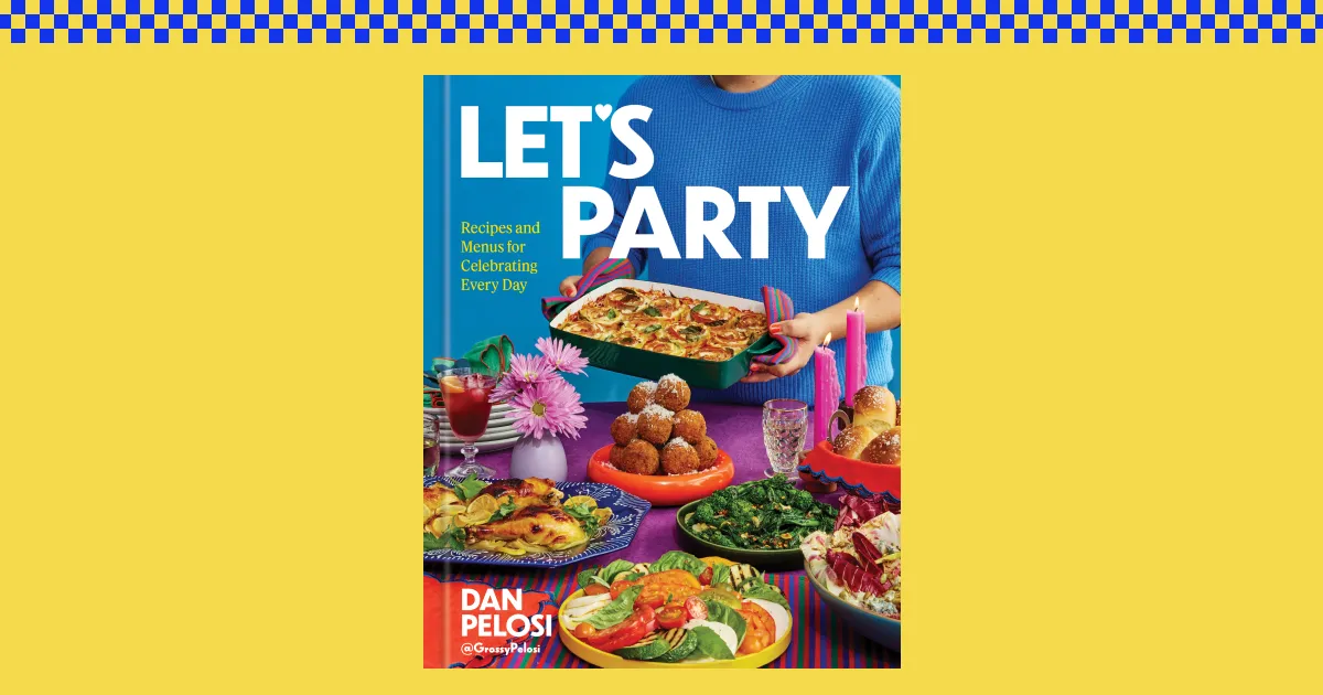
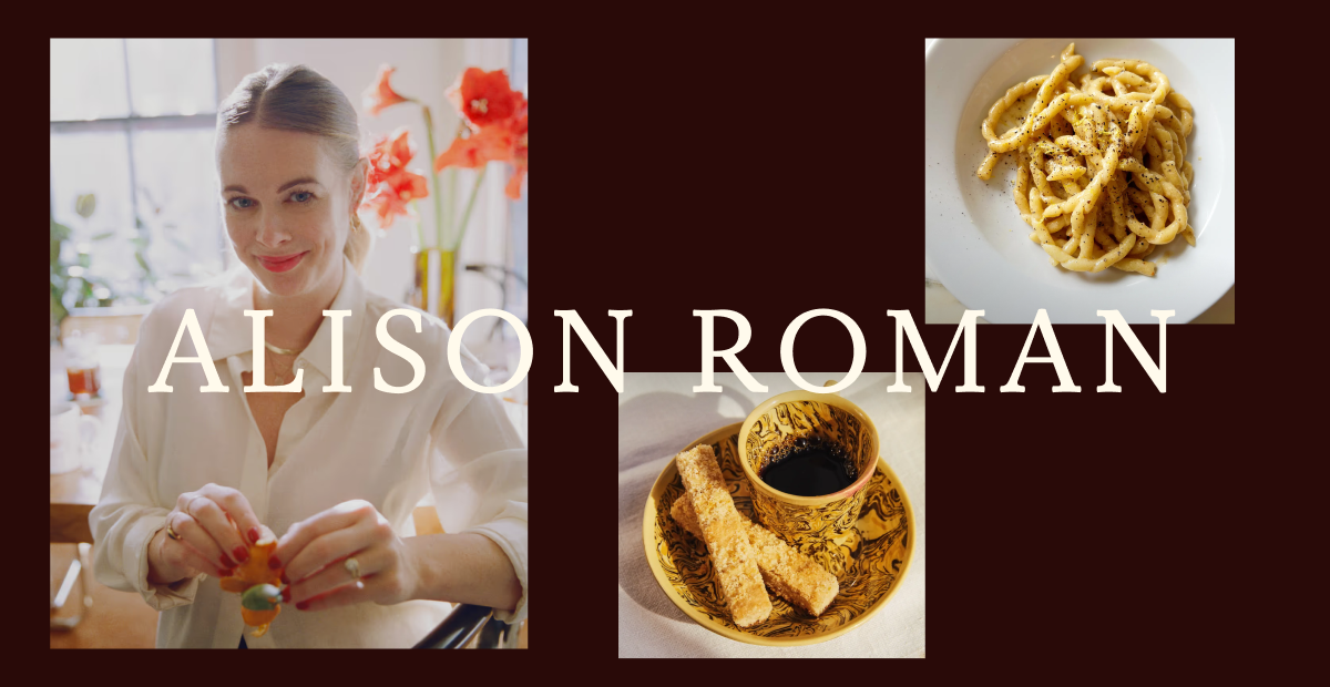
Creators, media, and personalities whose audience overlaps ours and whose voice or humor speaks the same language. We don't compete with these — we listen, we learn, we want to be seen alongside them. The heavy weighting toward food creators is intentional: pretti.cool's customer lives at the intersection of design objects and food/kitchen culture (hosting, recipes, cocktail napkins, dinner-party gifting).

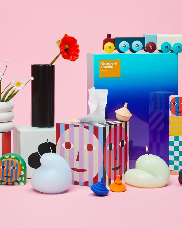
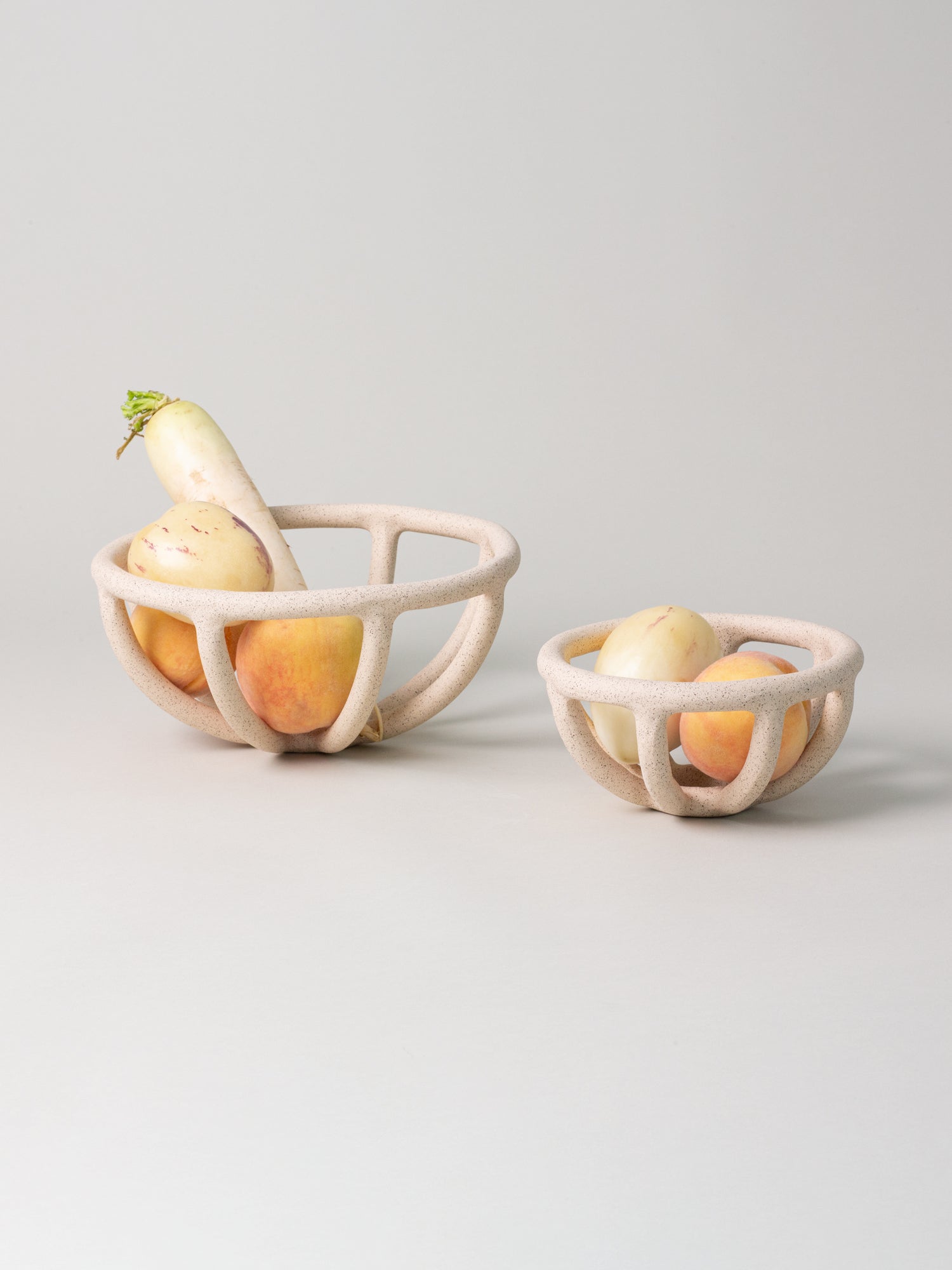
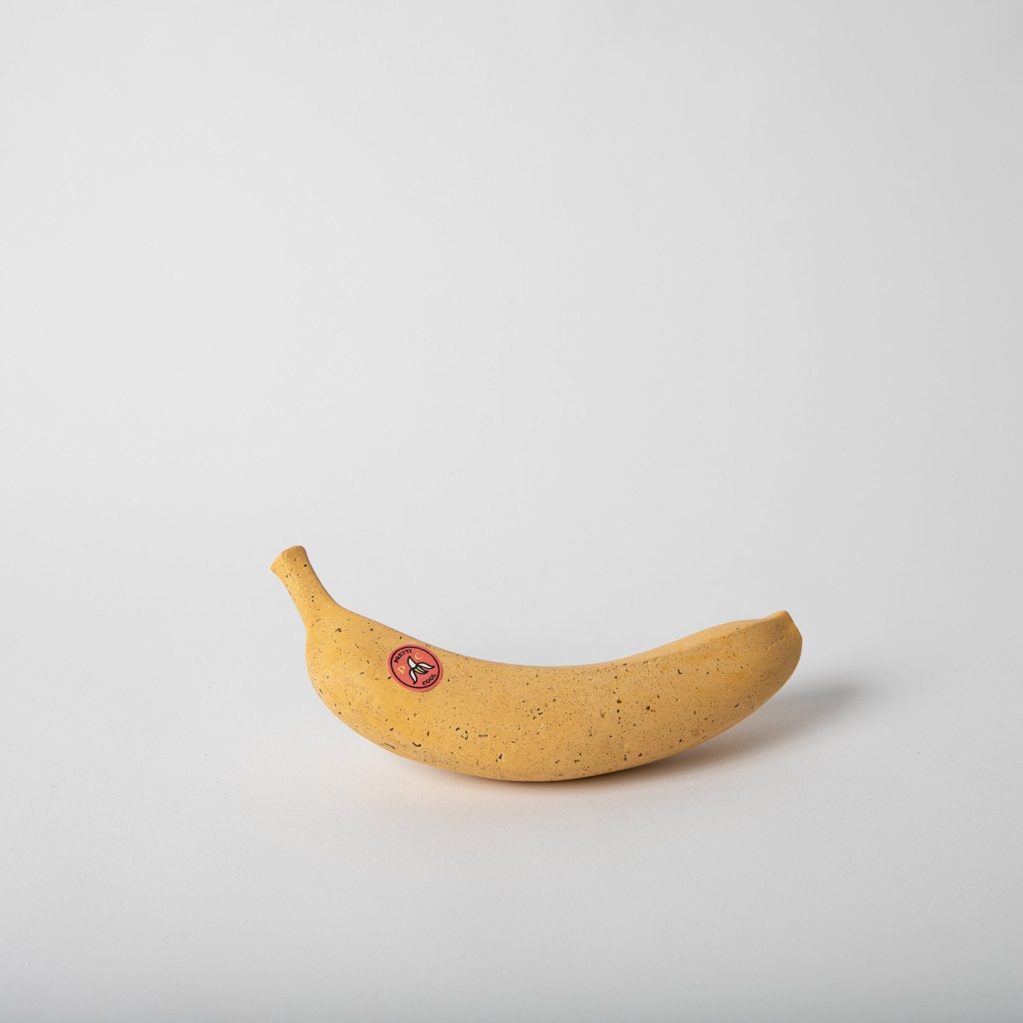
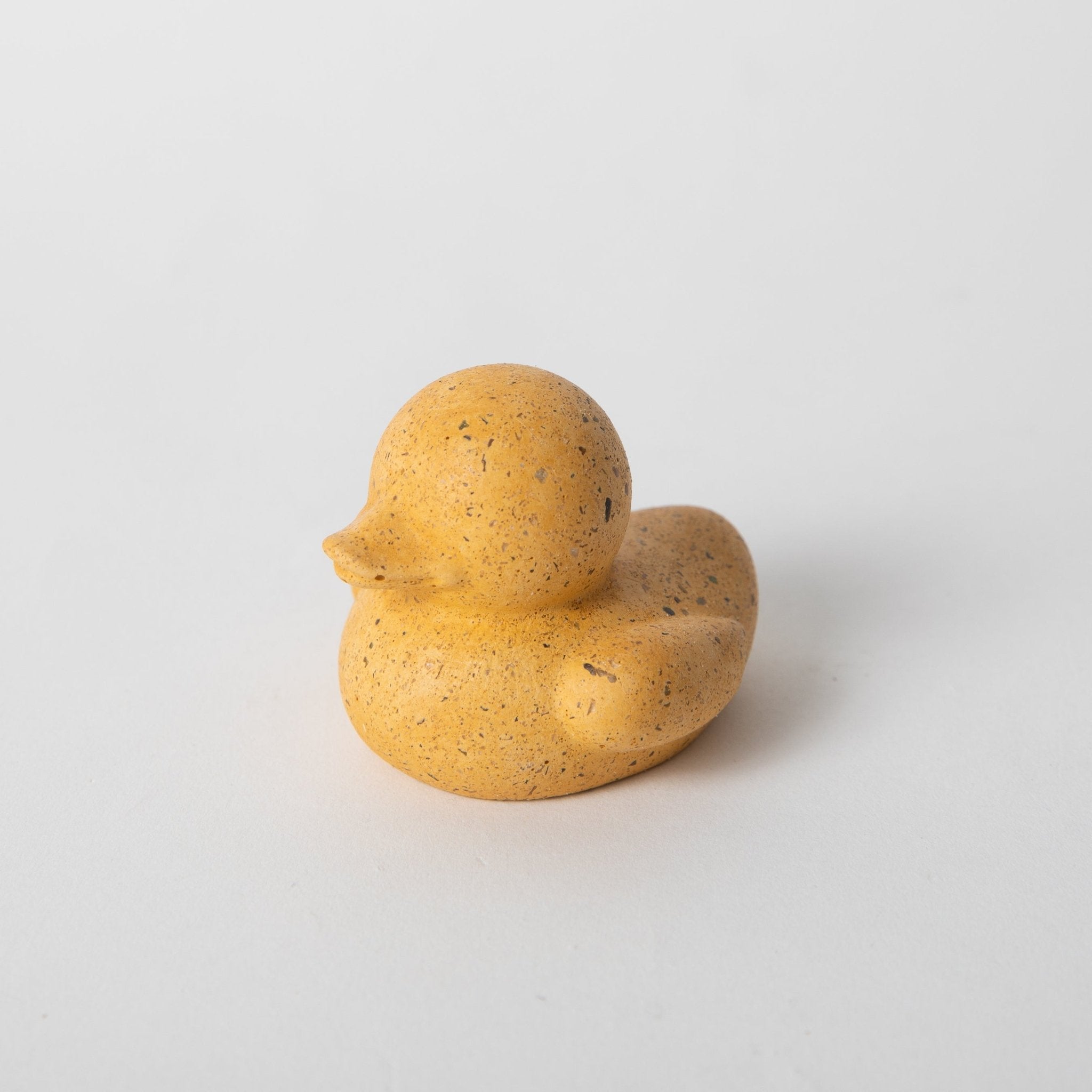
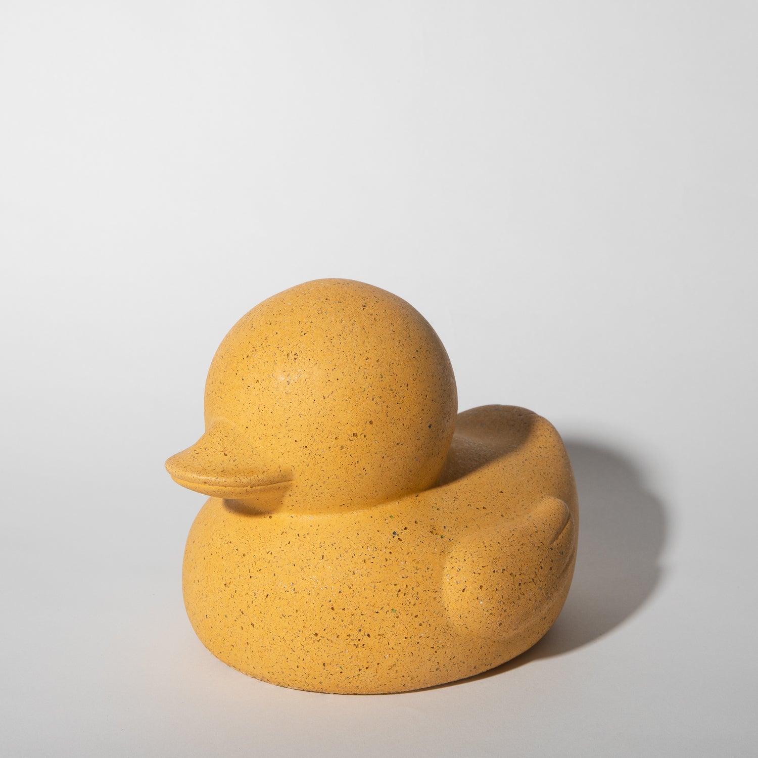
Top Sellers
The products that anchor the brand — the curated “Kathrine & Jeff's Picks” carousel from the homepage. These are the items new visitors meet first, and they're the visual + functional center of gravity for everything else we make. When in doubt about what a pretti.cool product looks like, look here.
Note: a couple of items on the homepage carousel are carried brands rather than pretti.cool's own products and are excluded here — the Shrimp Cat Toy (Ware of the Dog) and the Corn Cob Candle (food-shaped beeswax candles are a carried brand line, alongside Lemon, Pear, Heirloom Tomato, Casaba Melon, etc.). See the vendor warning in section 00.